It's two months since Scotland held its referendum and so I thought I'd collect together some data I was looking at back then. I didn't write it up at the time because I'd become a little weary of the whole subject, but now the time feels right for a retrospective.
My aim here is to analyse all the polling data in light of the final result and place it in a longer historical context. I strive to prevent any bias from creeping in, but I feel that honest subjectivity is a more realistic goal than objectivity, so please bear in mind that my preference is for Scotland to remain a distinct country within the UK. You can read more on my reasons in this first blog post on the politics and economics and a follow up post on inequality.
Comparing like with like
It's common to hear statements such as "45% of people in Scotland voted Yes and 55% voted No". This is in fact not true because it ignores the fact that 15% of registered voters didn't vote. The correct statement is that "45% percent of people who cast votes voted Yes and the 55% voted No".
Now, don't get me wrong, 85% is a fantastic turnout, especially compared with the last Scottish election (50% turnout in 2011) and the previous UK election (65% turnout in 2010). But it still means that 85% of 55%, which is 47% of registered voters voted No, and 38% of registered voters voted Yes. I could insist on even more precision, in that it's estimated that 97% of those eligible actually registered to vote. However, that 3% gap is not only less significant, it's also more uncertain because some people wish to avoid making themselves known to the authorities.
Does this attention to detail matter? Definitely, because if you ignore it, you can end up either estimating double the swing to Yes, or else concluding that there was no swing at all. There are many examples to choose from, but let's take one of the most prominent: a Guardian piece by Irvine Welsh that appeared on the front of the Observer on the Sunday after the referendum. It contained this:
The process and the subsequent debate, which they won handsomely, took support for independence from around 30% to 45% and heading north.
The first half of that sentence is a matter of opinion, and I'm comfortable disagreeing with Mr Welsh on that, but the second half is a statement of numerical fact - and it's wrong. As we'll see below, the 30% refers to the Yes figure in a Yes/No/Don't Know trio from opinion polls, so the correct figure to compare it against is not 45%, but 38%.
You can judge for yourself how public opinion changed by looking at this graph of polling results from January 2012 up until the referendum on 18 Sept 2014:
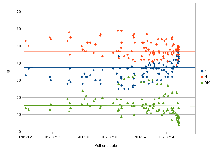
Source: A plot of all polls from 2012 to 2014 prior to the referendum. Don't Knows are kept separate. Data after 31 January 2013 is from a CSV download from whatscotlandthinks.org, and data before that is obtained via the list on Wikipedia which I've checked back to original publications. The horizontal lines show the result of the actual referendum, though bear in mind that the green line represents "Did not vote" which doesn't necessarily mean the same as "Don't know".
The scatter is very large, but it's clear that the Yes vote slowly increased during 2014. There's a weaker indication that Don't Knows increased during the same period. In contrast, it's hard to see a trend for the No vote amongst the scatter. In the weeks before the referendum, the Don't Know percentage drops, and both the Yes and No percentages rise as people make up their minds. What's striking is that those final polls overestimate the Yes and the No vote percentages, and their Don't Know percentages underestimate the 15% of people that did not vote.
Much of the scatter can be explained by the different questions and approaches used by different polling companies. For example, those that use online panels where people sign up to take part are probably biased in favour of people who have made up their minds, and so produce lower Don't know figures than random-dialled telephoning or in-person interviews. Such non-online polls were less common, but make up most of the Don't Know points plotted above 20%.
So, my version of Irvine Welsh's 30% to 45% statement is the more verbose but carefully qualified:
Opinion polls from 15 October 2012 (the Edinburgh agreement) until the end of 2013 show a support for Yes in the range 25% to 45%, No in 40% to 60%, and Don't Knows mostly sitting in 10% to 20%. The final result was that of all registered voters, 38% voted Yes, 47% No, and 15% did not vote.
So why did Mr Welsh compare the 30% figure with 45%? Because it makes for more dramatic sounding news and exaggerates the swing to Yes. By making selective comparisons, it's just as possible to argue - disingenuously - that there was no swing to Yes at all. Take Panelbase, who consistently found a higher Yes vote than other polling companies: their 12-20 November 2013 poll found 38% Yes; 47% No; 15% Don't know - identical to the final result. So, on the basis of that one poll I could claim (but I do not) that the Yes campaign made zero progress in the last year of the campaign. I could go back another year, and claim no progress was made in the two years from Panelbase's 9-19 Oct 2012 poll (37%/45%/17%), and a similar result can also be found in the 27-29 Jan 2012 Ipsos Mori poll. However, exaggerated statements such as these are seldom made in public because "there was little change" does not make for interesting news. I would also hope that reputable journalists would know better than to misrepresent facts and figures in this way. I'll not mince my words - Irvine Welsh is guilty of such a misrepresentation, but then his talent is for writing fiction, not data-driven journalism.
Real figures for headlines
Let's take the 45% figure for Yes, because it is most quoted in the media, and imprinted on many an avatar in social media, and estimate a reasonable pre-campaign figure to compare it against.
By taking the average of all eight polls in 2012 - the year of the Edinburgh agreement - I find the averages for Yes/No/Don't know were 32%/53%/15%, which can be compared to real result of 38%/47%/15%. If we now exclude the Don't Knows then the eight polls of 2012 average to 38%/62%, which we can compare with the real result of 45%/55%. (Note: All of these averages were weighted by the sample size, but this made little difference because almost all polls have a sample size close to 1000. The exception was a Lord Ashcroft poll ending 9 May 2013 which had a sample size of 10,007, but I excluded this from the dataset because its quoted percentages added to 108%.)
The table below shows the averages for 2012, 2013 and 2014, using data from a CSV download from whatscotlandthinks.org.
| Year | No. Polls | Yes | No |
|---|---|---|---|
| 2012 | 8 | 38% | 62% |
| 2013 | 31 | 39% | 61% |
| 2014 | 71 | 45% | 55% |
| Actual | - | 45% | 55% |
It's clear from this there was hardly any change during 2012 and 2013, but that the Yes vote increased by 6pp during 2014. However, bear in mind that polls were held more frequently as the referendum day approached, so the 2014 average is not evenly weighted over time. In particular, I wouldn't attach too much significance to the fact that the 2014 average is the same as the actual result.
You can better appreciate the data behind these averages in this graph:
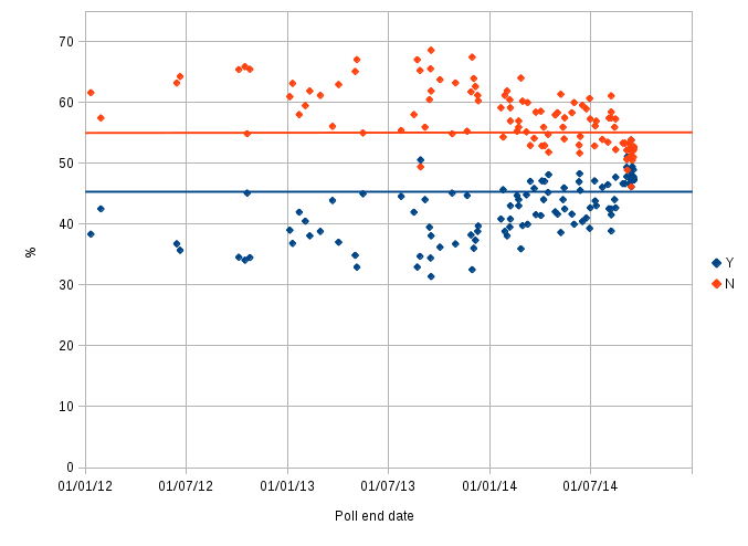
Source: A plot of all polls from 2012 to 2014 prior to the referendum. Don't Knows are excluded. Data from 1 Feb 2013 is from a CSV download from whatscotlandthinks.org, and data before that is obtained via the list on Wikipedia.
Notice that this graph is perfectly symmetric - you can fold it along the 50% line and each red dot will land exactly where there's a blue dot. This is because we've discarded information by excluding the Don't Knows leaving us with two percentages that must add to 100%. So, unlike the graph above, which shows the Yes increase with little decline in No, this one portrays a false symmetry. The advantage is that it's a bit simpler and clearer, but it conceals information on when, and if, people came to a decision.
With that in mind, there are two things to note about this graph.
Firstly, the drift towards Yes began before the official campaigns got underway on 30th May 2014. This can be intepreted as an effect of pre-campaign activity in local meetings and in social media such as Facebook and Twitter, but also, as you'll see below, there's historical evidence that shows a rise in support for independence whenever Scottish constitutional issues are raised.
Secondly, there is little correlation with high profile announcements and events in the mass media, notably the high profile TV debates that took place in August and the hurried and desperate-seeming visits and vow of the Westminster leaders. I wondered if the scatter hid any such correlation, but I found none even when plotting graphs of data from a single pollster, for which I used both the BBC's poll tracker and the tools on whatscotlandthinks.org. In fact, the only sudden change that can be seen in the above graphs is the narrowing of the gap between Yes and No at the start of September 2014, which took most people by surprise precisely because it wasn't obviously prompted by any event or disclosure of information. With hindsight, the change seems more likely to be a change in how people responded to polls than a simple shift in voting intention. It may be related to the Spiral of Silence (or Silent No) effect that I discussed in a previous blog post.
The long view
We can look at data going back to 1978 thanks to Ipsos Mori (formerly called just Mori). The cavaet they state is that the question being asked and the way it has been presented has changed over time, but, of course, that's also true of the previous two graphs.
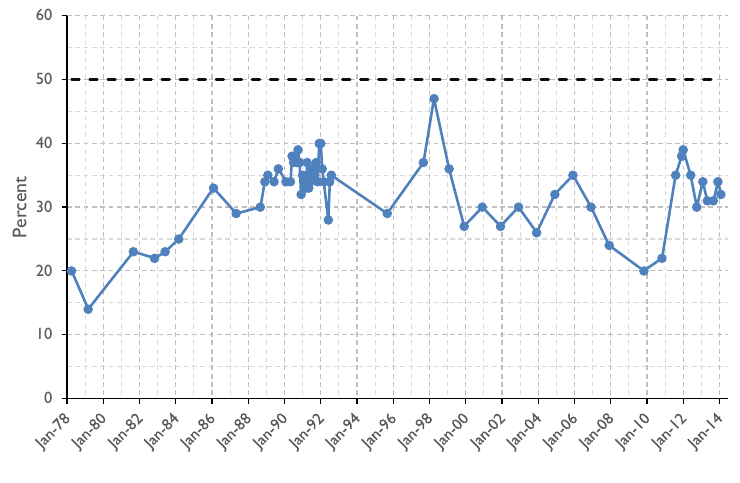
Source: Data from Ipsos Mori, taken from Figure 2 in the House of Lords library note LLN-2014-027.
This data shows percentage support for independence that's most directly comparable with the 38% of registered voters who voted Yes in the 2014 referendum. Please do not compare it with either the 45% Yes vote figure, or the above graph that excludes Don't Knows. To double check this point, I verified that the last two data points shown in this graph are for the Ipsos Mori polls for STV which gave Yes/No/Don't trios of 34%/57%/10% in December 2013 and 32%/57%/11% in February 2014.
As you can see, the majority of polls since the mid-1980s show support for independence has been between 30% and 40%, though there was a pronounced dip to 20% in the wake of the financial crisis of 2008. It reached an all-time peak of 47% in 1998 just after the Scottish people approved devolution in the 1997 referendum, and it only matched this level again in the STV/Ipsos Mori poll a few days before the 2014 referendum (not shown on this graph).
So, taking the long view, the referendum result of 38% for Yes, or 45% excluding Don't Knows, is not at all unprecedented, but consistent with the run of Scottish public opinion over the last three decades.
Final thoughts
Rolling issues up into a single number is always a gross oversimplification, and although 38% (or 45% if you prefer) is not unprecedented, the circumstances in society, politics and the economy are far from normal. What's different now to the previous peak periods in support for independence - specifically, devolution in 1998 and the poll tax in the early 1990s - is that dissatisfaction with traditional politics and inequality is evident throughout the Western world and is not just confined to Scotland. Low voter turnouts, upsets to traditionally dominant political parties, social unrest and even riots are occurring across Europe, especially in Italy, Greece and Spain where the financial crisis hit hardest, but also over the Atlantic in the USA. An understanding of the changes occurring within the UK has to be understood in the context of this more global situation.