I've been looking at the age distribution of people in Scotland and made this animation to visualise trends between 1982 and now - a period of 33 years.
Source: National records of Scotland
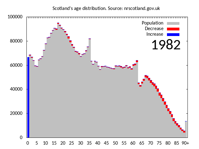
Additions to the population are highlighted in blue and people leaving Scotland are in red, including those who have shuffled off this mortal coil.
The conveyor and baby boomers
The graph appears to be on a conveyor belt, with features remaining recognisable as they move from left to right. This is of course because people age by one year every year: this year's 31 year olds were last year's 30 year olds.
The two most notable features are a broad hump aged around 20 in 1982, who end up in their 50s in 2015, and a narrow spike of people around age 34 in 1982 and 67 in 2015. These correspond to baby-boomers born in the late 1950s and 1940s respectively.
The famous late 1940s baby boom is associated with the ending of World War 2 but there was also a similar one after World War 1. You can see this as a "cliff" at age 62 in 1982. This cohort reached age 90 in 2010 causing a big jump in the 90+ bar.
Notice there are gaps between peaks in age. In 2015, 12 and 13 year olds are rarer than any other ages under 70.
Birth and death
The height of the bar for age 0 is shown in blue because this is always an addition to the existing population. It reflects the annual birth rate which rises and falls, but has an overall decreasing trend over this time period. For any age above zero, the population will decrease slightly from year to year because of deaths: sadly, not all 30 year olds make it to 31.
The death rate becomes higher at older ages and so the end of the distribution is sloping and shows a strong red fringe. You'll notice that the height of the death slope is higher in 2015 than in 1982, i.e. there are more older people now than 33 years ago. In particular, the number in the 90+ category have more than trebled in the last three decades.
Migration
The broad, baby-boomer hump that's at young adulthood in 1982 shows a strong red fringe. It continues to decrease through the 1980s before stabilising by the mid-1990s. This decrease is due to net emigration, i.e. more people leaving Scotland than arriving.
From the mid-1990s onwards you can see evidence of net immigration as a blue fringe for ages 20-30. This becomes more prominent through the 2000s to now.
Some details
When a red bar is present the population for that age is equal to the height of the grey bar only. The red bar represents the decrease, specifically, its height is last year's population at age n-1 minus this year's at age n.
For all other bars the population is the height of the grey bar plus the blue bar, where the height of the blue bar is this year's population at age n minus last year's population at age n-1. The bar for 90+ is always grey.
I made the animated gif using the excellent and venerable gnuplot. The gnuplot script, some java code for pre-processing and the CSV file it used (data from NRS link above) can be found in this zip file.