Poor analogies, partial information, misunderstandings, oversimplifications and outright lies seem to be too common in any political discussion. I'm not just talking about partisan politicians and the media, but also discussion in online social media and in real life. Such misconceptions are especially troubling concerning the great recession of 2008/9 and its aftermath in the UK. If we do not understand what has happened, there is little chance we can improve matters and prevent it happening again. So I decided to investigate the data for myself and write a series of blog posts about it. The big questions I hope to answer are: what effects have government actions already had, and what future governments can do to create a true economic recovery, by which I mean increase well-being, employment and wealth, whilst reducing inequality.
I've pulled all the data directly from the published government statistics and accounts and spent much time making sure I understand the accompanying documentation. I'll give precise links to all this information and you can also check the spreadsheet I've constructed to produce all the graphs in this post: download ods or download xls.
As far as possible I've confined political comment to the final section of each post, so that all other sections describe the data itself. The data used in this post is the quarterly time series from 1997 to 2014Q2, which is the full dataset available at the time of writing.
UK GDP
GDP or Gross Domestic Product is the total value added in producing goods and services produced in the economy. For example, for a company making steel girders, its contribution to GDP would be the amount made from selling the girders less the amount paid for the raw steel. Notice that this contribution to GDP will therefore include the company's profit, what it pays its employees and what it pays in tax and rent.
Here is the graph of GDP.
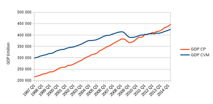
Source: Office of National Statistics (ONS) National Accounts Q2 2014. The GDP CVM data are the seasonally adjusted, chain volume measure (SA CVM) labelled as ABMI in the "A2 Aggregates" tab of the data tables spreadsheet. The GDP CP data are labelled YBHA on the same tab of that spreadsheet.
CP stands for current prices and refers to the fact that the values are not adjusted for inflation. The CVM is adjusted for inflation and expressed in terms of the value of prices in 2011. The GDP CP curve is steeper because it is showing the effect of both inflation and growth together. Most quoted GDP figures are CVM.
You can see that GDP increases at a steady rate until 2008 when it dipped sharply. After 2009 it began to grow again. The CVM pre-recession peak value of 2008Q1 was reached again in 2013Q3.
I'll calculate the growth rate of GDP as follows:
growth rate for quarter = (this quarter's GDP - last quarter's GDP) / this quarter's GDP
Note that this a quarter-to-quarter growth rate. It's more common to see annual growth rates quoted - these will be larger than quarterly ones. Here is the graph of GDP CVM growth.
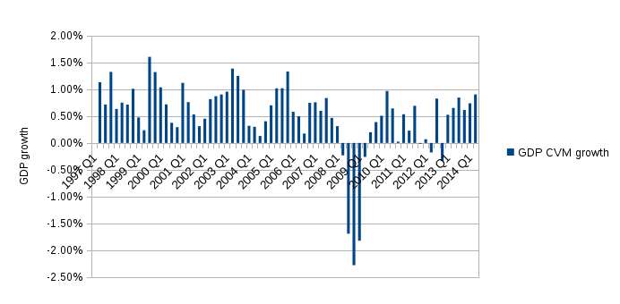
This graph shows that the growth rate is always positive (i.e. the economy grew) until 2008Q2 when it went negative for five quarters in a row. Two consecutive quarters or more of negative growth (i.e. decreasing GDP) is commonly taken as being the definition of a recession. GDP growth returned to being positive in 2009Q3. From 2011Q4 to 2012Q4, the growth was mostly close to zero or negative, which prompted people to speculate the economy had entered recession again making for a so-called double-dip recession. Technically it isn't according to this data because there aren't two consecutive quarters with negative growth in 2011/12. But, to me, that's beside the point - the recovery was weak and faltering. To put some numbers on it, pre-recession, from 1997Q1 to 2008Q1, GDP growth averaged 0.75% from one quarter to the next. From 2009Q3 to 2014Q2 it averaged 0.44%.
In fact, the 0.44% is generous because it ignores the five quarters of the recession itself. If we include them, the quarter-to-quarter growth (i.e. from 2008Q2 onwards) averages to 0.1%. If growth had carried on as it had done from 1997 to 2008 for another six years, then we should have seen GDP at around £480 billion in 2014Q1, but in reality it was £420 billion. So although we can say that GDP growth has recovered to a degree, the effect of the recession is to leave GDP £60 billion below where we could have expected it. Whether that expectation is reasonable is a separate question.
The Public Sector
GDP is a measure that applies to the whole economy, but the next couple of sections address the debt and borrowing of the public sector, so it's necessary to define what is meant by that.
The UK public sector includes the central government, local government, the Bank of England and all organisations in public ownership. This not only includes constructing and running facilities such as hospitals and schools, but also the employment of doctors, nurses, teachers and other admin staff. The public sector also includes formerly private business such as banks and railway operators brought into public ownership for a variety of reasons, but mainly because they were failing in private ownership. Network rail was the most recent private company to be taken into public ownership.
I will use the "ex" figures of public debt and borrowing, that is ones that exclude "temporary" effects due to special measures dealing with the recession. In particular, this excludes assets associated with Quantitative Easing (QE) and with banks taken into public ownership. There is some sense in doing this because it is expected that QE will be reversed at some point and the banks will be returned to private ownership. Using the ex figures also allows a more meaningful comparison with the economy prior to the recession. I'll deal with the non-ex values of debt and borrowing in a future blog post.
Public Sector Debt
Here is the graph of the UK's debt.
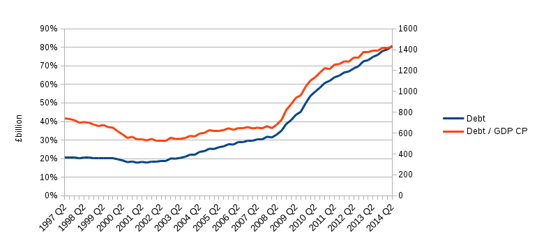
Source: Office of National Statistics (ONS) Public Sector Finances August 2014 release. The data plotted are "Public Sector Net Debt excluding public sector banks" (PSND ex) labelled as HF6W in the "psa1" tab of the data tables spreadsheet. The debt value is in "current prices" and so is not adjusted for inflation. Also plotted is the debt as a percentage of GDP CP. This is more informative because, for example, a £1 billion debt is a much more pressing concern for an economy with GDP £1 billion than it is for an economy with GDP £10 billion. As a convenient side-effect, expressing debt as a percentage of GDP CP also corrects for the effect of inflation.
The debt/GDP falls from 1997 until 2001, then increases slightly until 2008 after which it rises much more rapidly. Clearly, the majority of the debt was added after the recession hit in 2008.
Public Sector Borrowing
Each time an amount is borrowed, the debt will rise by that amount. In this sense you can think of debt as being the accumulation of all past borrowing. Conversely, you can think of borrowing as being the growth rate of debt. Here's the graph of borrowing for each quarter.
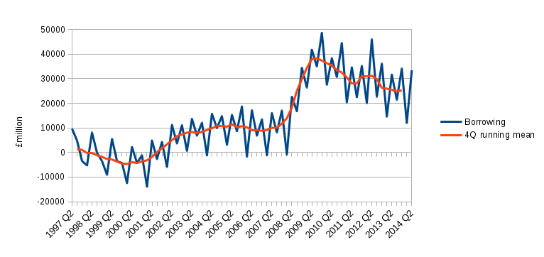
Source: Office of National Statistics (ONS) Public Sector Finances August 2014 release. The data plotted are "Public Sector Net Borrowing excluding public sector banks" (PSNB ex) labelled as J5II in the "psa1" tab of the data tables spreadsheet. Note that these data are not corrected for inflation.
This graph shows that borrowing in a given year tends to be larger in Q2 and Q4 than it is in Q1 and Q3. To smooth such seasonal variations and bring out the trend a four quarter running mean is plotted. The running mean data point for 2012Q2 is the average of the values of the four values 2012Q1, 2012Q2, 2012Q3, 2012Q4, and the data point for 2012Q3 is the average of 2012Q2, 2012Q3, 2012Q4, 2013Q1 and so on.
Bearing in mind that borrowing is the growth rate of debt, the longer term trends are just the ones we saw before: borrowing goes negative (money is paid back, debt falls), then in 2001 borrowing becomes positive (debt rises) and then from 2008 borrowing is significantly larger (debt rises faster). This graph shows that borrowing starts falling in 2009 - something which isn't clear from the debt graph.
If you look closely at the data you might see that the increase in debt each quarter is not equal to the borrowing for that quarter. This isn't a flaw in my graphs, nor is it in an error in the data from the ONS. It is quite real. If you want to investigate this further you can start your journey of discovery on page 10 of the Public Sector Finances, August 2014 document. I'll come back to this in a future blog post.
Political comment
The UK had a Labour government from 1997 until mid-2010 when a coalition of Conservatives and Liberal Democrats came to power. There are two points I'd like to address that are relevant to these governments: the recovery in the year or so after the main recession dip, and the timing of the debt build-up.
Gordon Brown was the UK chancellor from 1997 until 2007, and prime minister from 2007 to 2010 during which time Alistair Darling was chancellor. Brown and Darling were credited by world leaders and respected economists for acting decisively as soon as the financial crisis hit in 2007/8 and limiting the worst of the damage, setting an example that others followed. Their actions were even endorsed at the time by Conservative George Osborne who became chancellor in 2010. If you look at the GDP growth graph above you will see that the economy recovered and had five consecutive quarters of respectable growth from 2009 into 2010. The growth faltered after the first quarter in which the coalition government was in power. It's not yet clear to me whether the new government did anything to disrupt the recovery, or if it was a coincidence of timing - that's a question for another blog post.
Many people believe that the Labour goverment was responsible for leaving the UK with a large debt before the recession because it spent too freely. This is the usual story told by the Conservatives, such as prime minister David Cameron, who came into coalition government from 2010. But it is clear from both the debt and borrowing graphs above that the first part of the claim is not true: the rise in debt was a consequence of the recession. I've even heard it said the Labour's overspending caused the recession. Not only does this put effect before cause, but a claim that a global recession could be caused by a UK government's spending policy is ridiculous. In fact, the debt graph shows that Labour had slightly reduced the debt/GDP percentage between 1997 and 2007.
I know many threads are left dangling in this blog post, but I'll tie a few of them up in the next one which looks at the UK budget deficit and the associated public sector spending and income.